4 minutes
PyGrunn Winter Hackathon 2012
Few days ago, actually, more than one week ago (but I was very busy :) we made our first PyGrunn hackathon. I was lucky and from all the list of ideas, the selected was one of mines! The slides generator, that finally we call hovercraft. Here is a small introduction about what I wanted:
A small platform to create slides and have them always associated to a web with this possibilities:
- Create an account with Google (or perhaps twitter, facebook…), but Google seems the best option for me now.
- Create or edit new slides related with this account. This slides creator/editor will have the following functionalities:
- Select one image for background in fullscreen.
- Write one or 2 lines of text that will always fulfill the width of the slide.
- Change the font family.
- Have a permanent link to your slide (completely public for now).
After the hackathon we got something very similar to what I wanted, with some small issues. But this post is not about what we did wrong! This post is about which technologies did we use to finish the project and perhaps, if I am lucky, start a discussion on why we did/didn’t make a good choice.
How do we achieve this?
Backend
The backend of the application was almost inexistent, we only wanted to allow the users to login with a Google account to have access to edit their slides. Being a hackathon we didn’t spend time adding CRUD (Create/Read/Update/Delete) functionalities to manage the users.
If you want to delete your user, let me know, I will do it by hand :) It was made with Flask, Flask-OAuth for the authentication with Google and redis to store the presentations.
Frontend
The viewer was really simply too because from the beginning we wanted to play with the editor (it was more funny). For doing it we used revealjs to show the presentation with slide effect and jquery-fittext to make it fullslide.
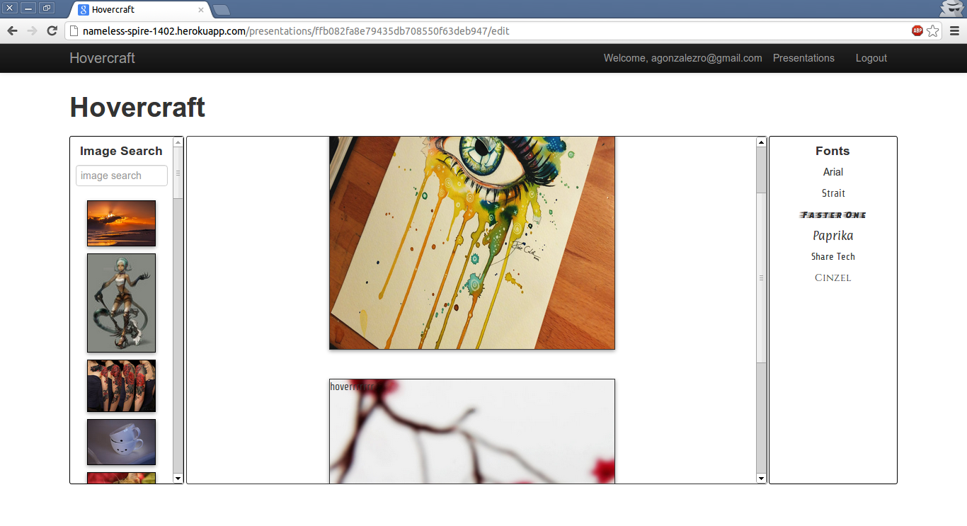
Now the important part! We made the editor with backbone and underscore, it seems to us the better choice, since we will have 3 principal views:
- The background chooser
- which is connection to deviantart to perform a query of good backgrounds for your slide. Then you can click on one of the results and will be applied to the current slide.
- The font chooser
- which is loading some google fonts, we wanted to do this automagically but we couldn’t finish it at time. The behaviour is the same, you choose a font and its applied to the current slide.
- The slide content
- that should be WYSIWYG (What You See Is What You Get) but for now is on the middle, because we couldn’t make the text bigger while you are writing.
Deployment
And finally the deployment that was made with heroku and redistogo that allows you to use a 5M non-persistant DB that is good for a demo.
Resources
- You can see the list of all the projects or…
- You can find all the source on github or…
- You can try a demo too!
- And if you are too lazy to try it, here you have an screenshot:

Thanks!
I really want to thank Paylogic for letting us a place where to do the project and for provide us food & beers. What a developer will develop without food and beer?
I want to thank too all the guys that “spend” the weekend with me having fun, but working hard too!
Conclusions
The good point of all this editing is that thanks to backbone and thanks to the backend guys is saved without any action needed. The idea of this full project was:
- Have fun!
- Simplifying slide creation
- Make it really simply to share those slides.
I didn’t want to go really depth into the development of this project, I only wanted to give a quick overview of what we made in two days. But if you are really interested on something more explained, let me know on the comments and I will try to help you in all what I can.